What Size Should Blog Featured Images Be? (2026)
Unlike a marketplace or a social platform, no CMS enforces a strict pixel spec for featured images — WordPress, Ghost, and most site builders will happily display whatever you upload, at whatever size. That flexibility is exactly why so many blogs end up shipping featured images far larger than anything on the page ever displays them.
The practical range, and why
- 1200–1600px wide covers the vast majority of cases. Most blog layouts display the featured image somewhere between 600–1000px wide in the actual rendered page (including on retina/high-DPI screens, which effectively double the needed pixel density but still top out well under 1600px for a normal content-width image).
- Full-bleed hero images that stretch the full browser width can reasonably go up to 1920–2400px, since they need to stay sharp on large desktop monitors.
- Beyond those ranges, you’re shipping pixels the browser will never render — the browser downscales the display, but the visitor’s device still has to download the full file first.
The actual cost of oversizing
A featured image straight off a modern phone camera is commonly 3000–4000px wide and several megabytes. Displayed at 800px on a blog post, none of that extra resolution is visible — but every visitor’s browser still downloads the full multi-megabyte file before it can render, which directly hurts Largest Contentful Paint, the Core Web Vitals metric most sensitive to a page’s biggest image. This is one of the most common, and most fixable, reasons a blog scores poorly on PageSpeed Insights despite having “good enough” content and design.
Resizing a batch of post images to a sane width
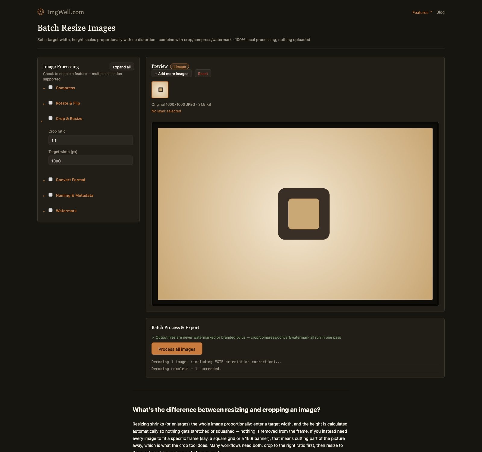
Our batch resize tool runs entirely in your browser — useful if you’re processing photos for unpublished draft posts.
- Drop in your images (folder import works for a whole batch of post images at once).
- Open Crop & Resize and set Target width (px) to
1600for standard content images, or up to2400if a specific post uses a full-bleed hero layout. - Height is calculated automatically from the original aspect ratio, so nothing gets stretched.
- If the images also need compressing, do both in the same batch pass — resizing down first means the compression step has far fewer pixels to work through, compounding the file-size savings.
Matching the resize to how the image is actually displayed — not to the resolution it happened to come out of a camera at — is the whole fix here.